
Misc. work
Collaby
Collaboration Tool: digital textbook for students
- Graphic Designer
- UX/UI Designer
- Researcher
Brief
Problem analysis
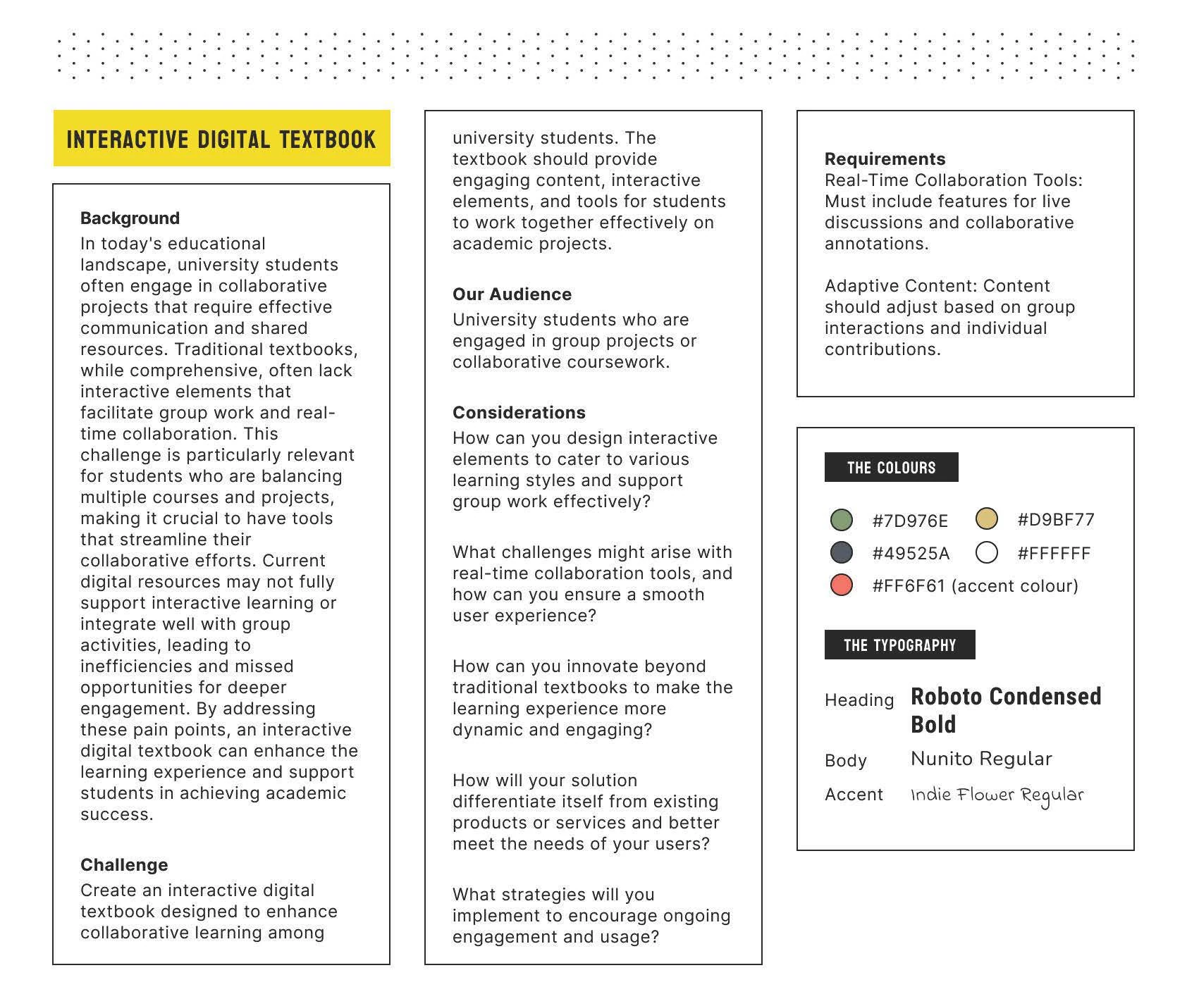
Traditional textbooks lack the interactive elements that facilitate real-time collaboration and group work. This is especially true for students who are tackling multiple projects at once. Most current solutions to this lack crucial functions to properly accommodate students and their need for interactive learning. The missed opportunity for deeper engagement has caused pain points that must be addressed to create a digital textbook that could enhance learning experiences.
User group research
Generally, any student would likely use a service like this. Despite the brief’s overall focus on a university student user base, a school student in either year 11 or 12 would also likely use and benefit from a product like this.
When looking at university students, a focus would be on those in fields that require a large amount of group collaboration and work outside of the usual class time, such as engineering, computer science or design, to name a few.
While the focus of the brief is, as mentioned above, relating to education and textbooks, a possible user base that should be considered is the 24 – 40 year age bracket, particularly those in the workforce. Collaboration could be a large aspect of many jobs; therefore, the design should not restrict users to just an educational scope.
University Students:
These students are motivated by the enjoyment of their particular field of study and want to acquire a job in their field. They are also defined by their lack of spare time through poor time management skills or various commitments taking up too much of their time. Therefore, to encourage them to return to an application, there should be a focus on a quick learning curve, helped by their increased skill level with technology and interfaces and clear features that provide tools to engage their minds and help with academic pursuits.
Collaborators:
These students often collaborate with others and hold a lot of prior skills when interacting and working within a group. They share the same time management skills and commitments as any other university student, with the main difference being their skill when using collaborative software. These students would generally get over the inevitable learning curve of using a new software quickly due to their experience.
Individual Workers:
These students often don’t collaborate with their peers outside of classes. Most of their assigned work is individual, and they are not required to interact with others when finishing work. Therefore, they would not be too experienced with the tools that this design solution is based on. They would also likely be using the app based on a recommendation from another student or for the features that translate to individual work, such as the textbook searching features.
The Unknowns:
Many of the features within this new application are taken from other apps or services that the main user base would likely hold access to, such as OneNote for collaboration, a library for their textbooks, etc.
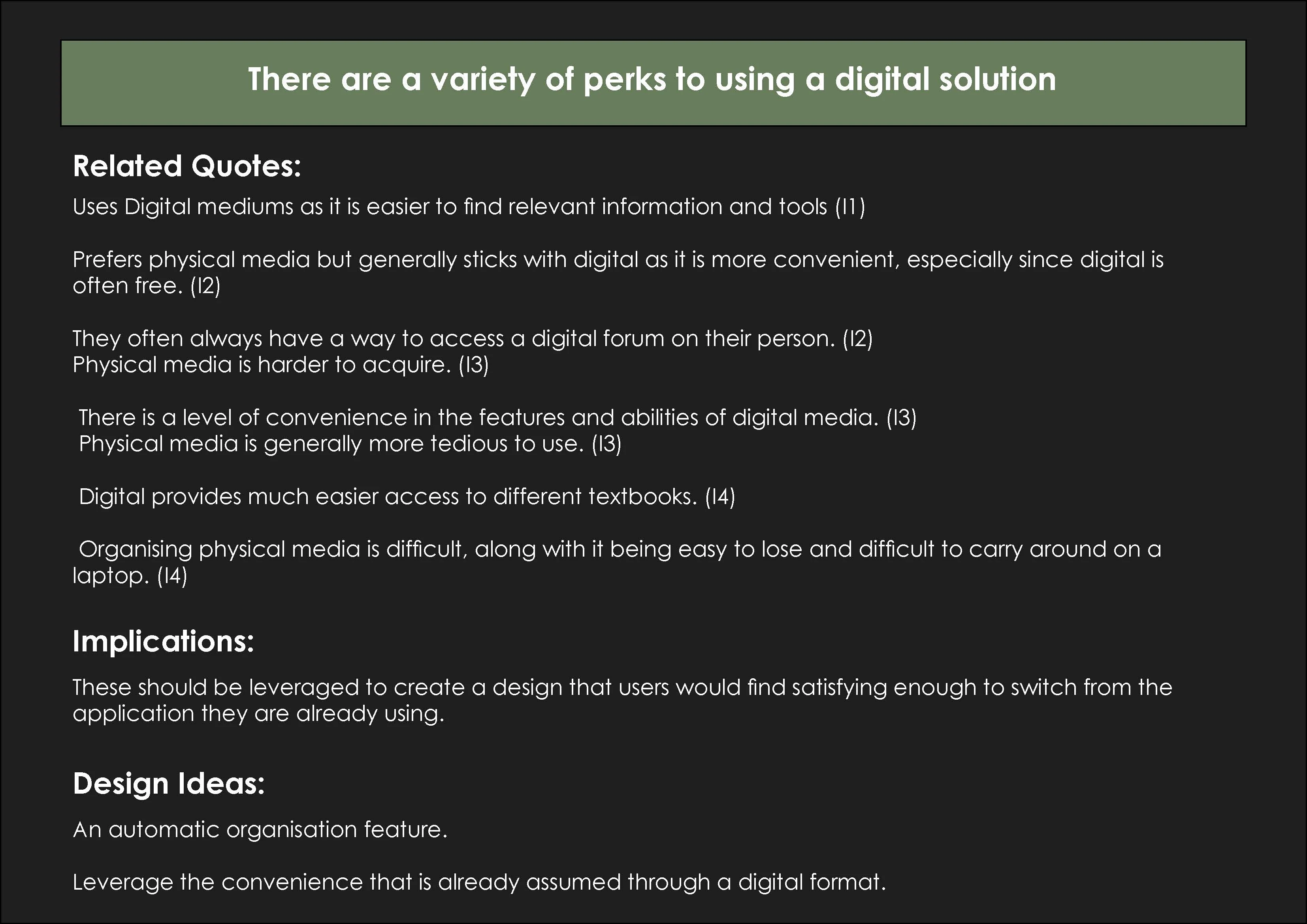
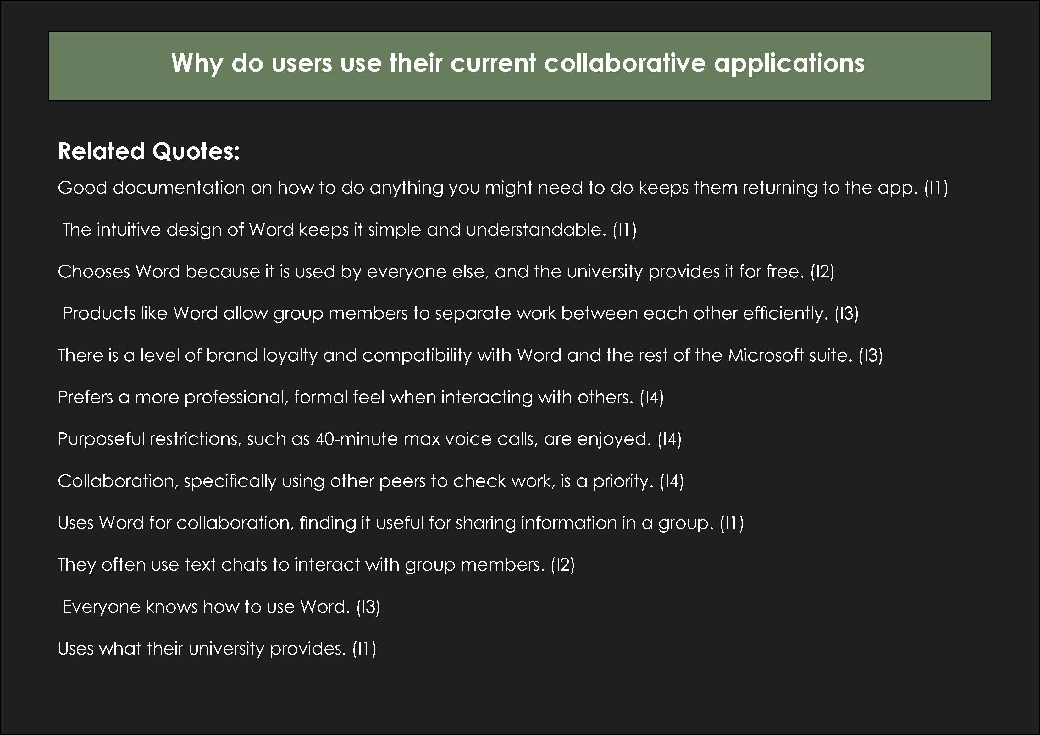
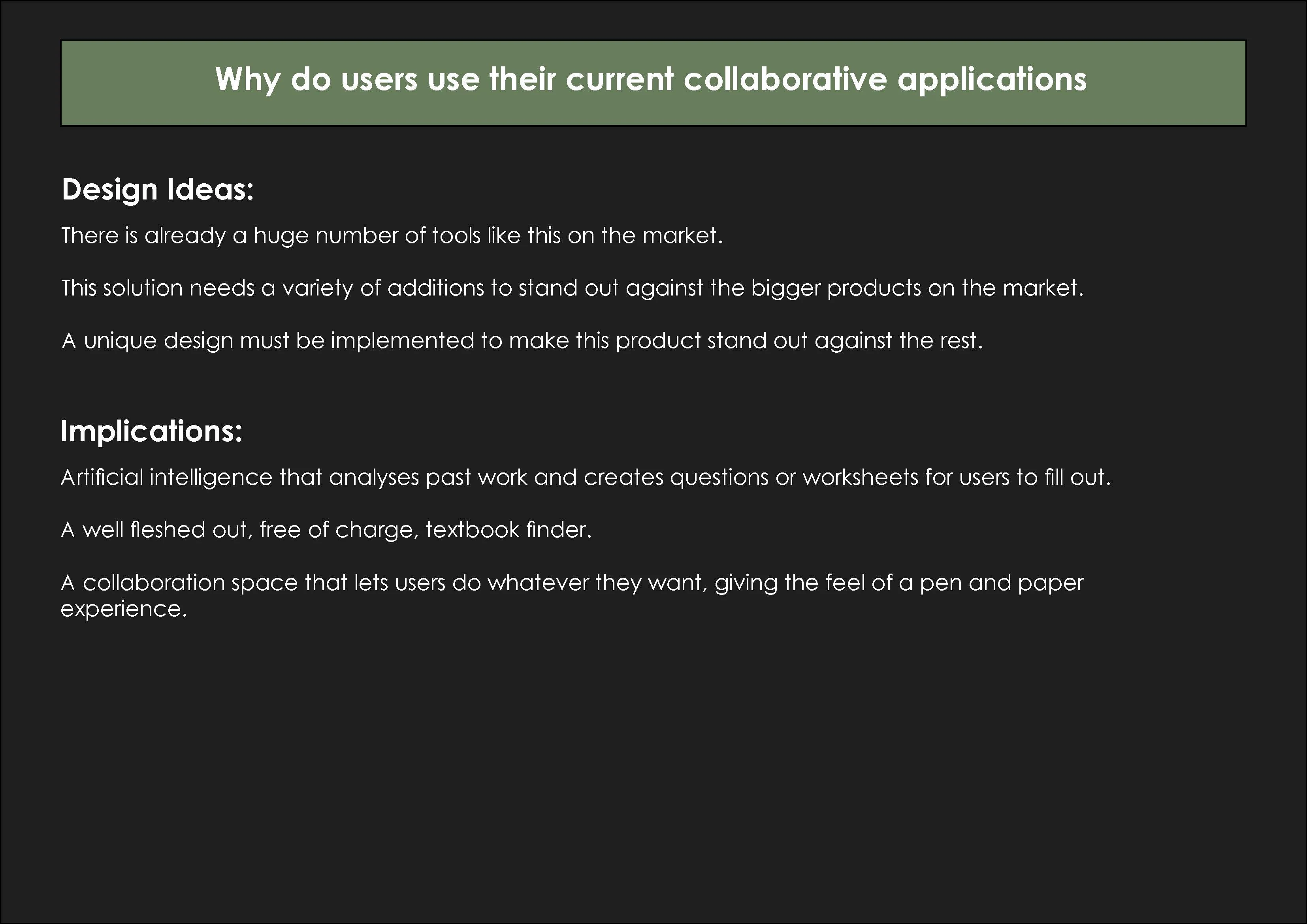
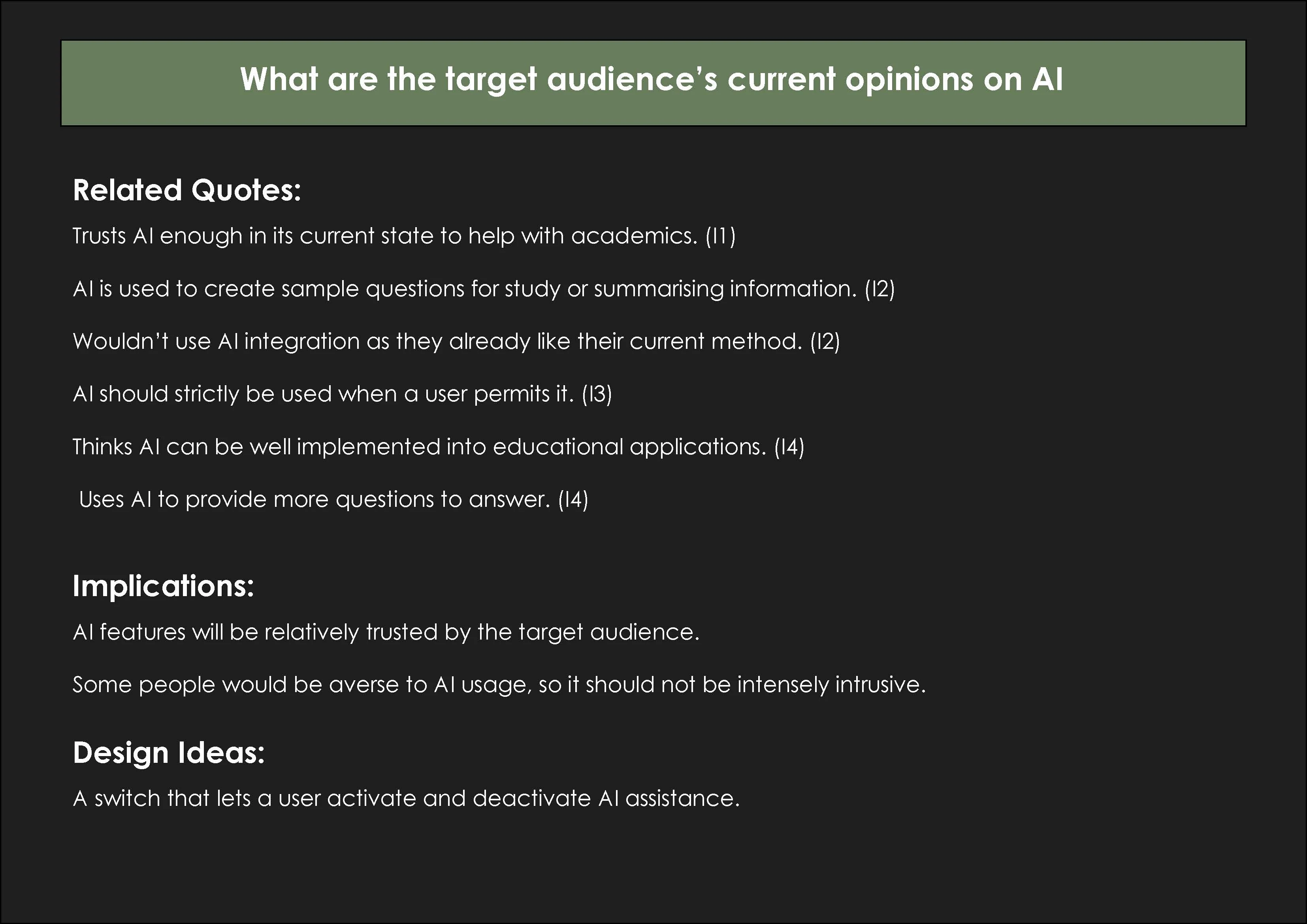
- Therefore, what would make users want to change from their comfort zone to a new method?
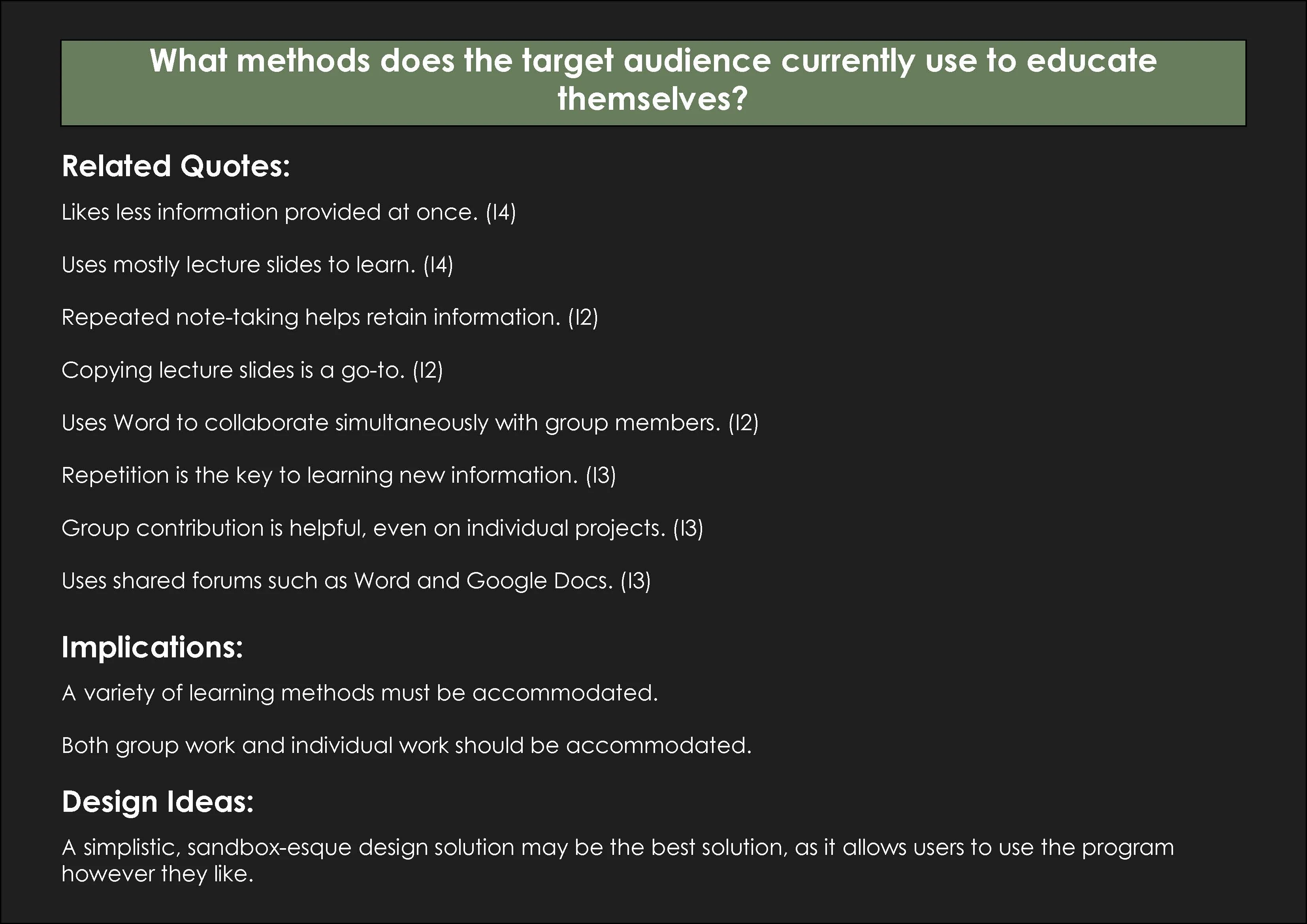
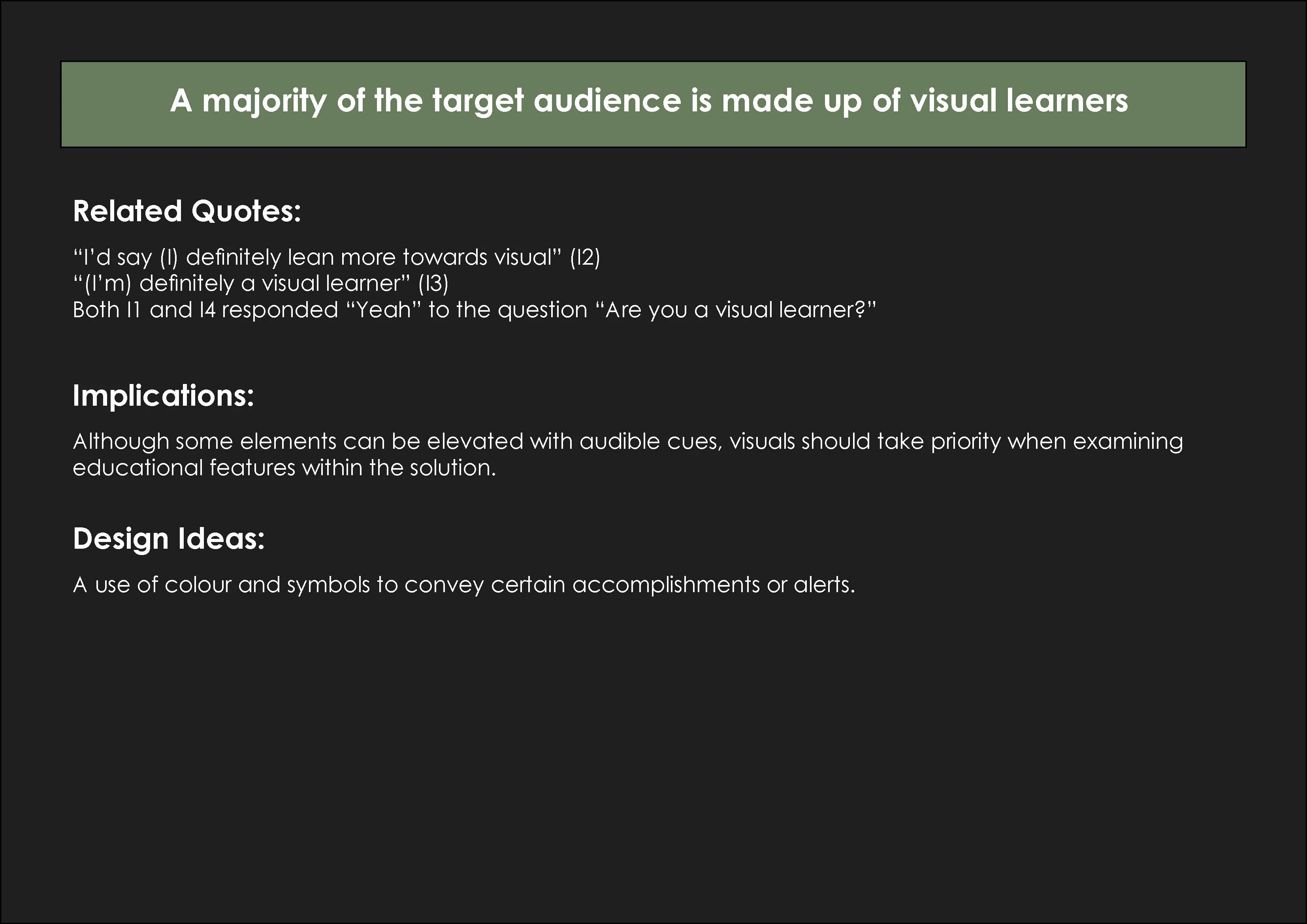
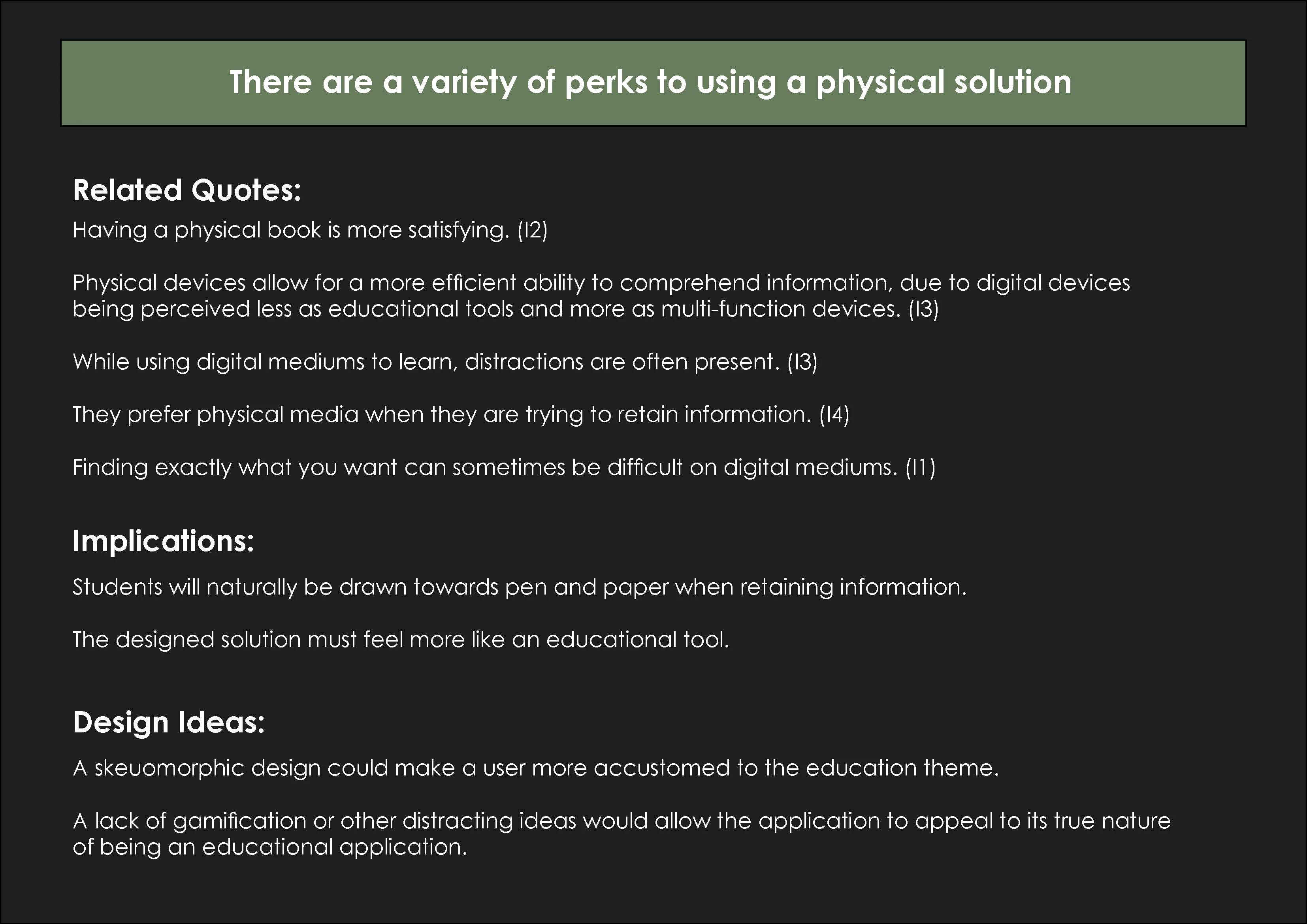
- How does our general user base learn best?
- Are our users too invested in the current apps they use?
- What do university students want when collaborating with peers?
- What do our users NEED as features in this application?
Quick findings
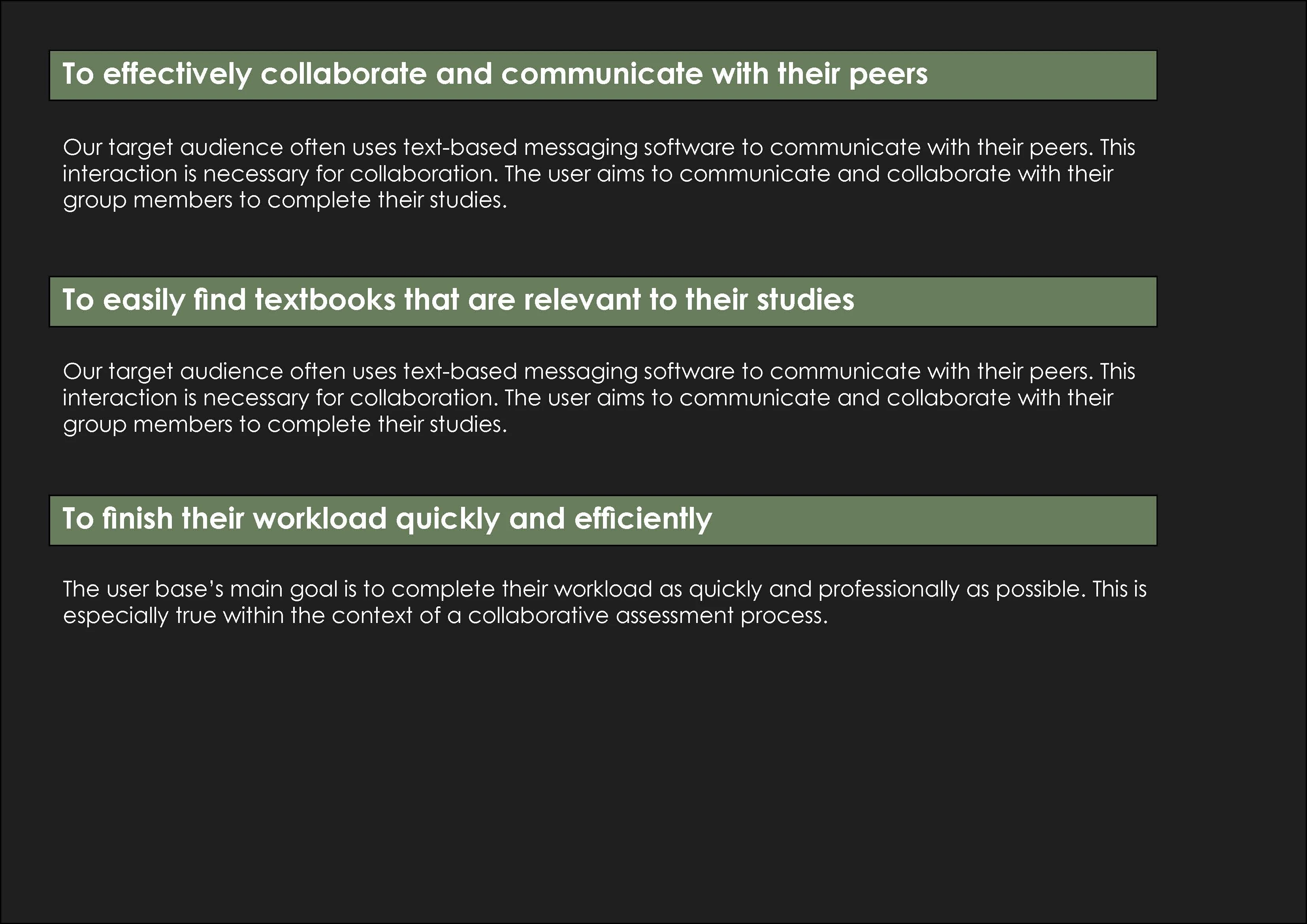
User goals
Main screens
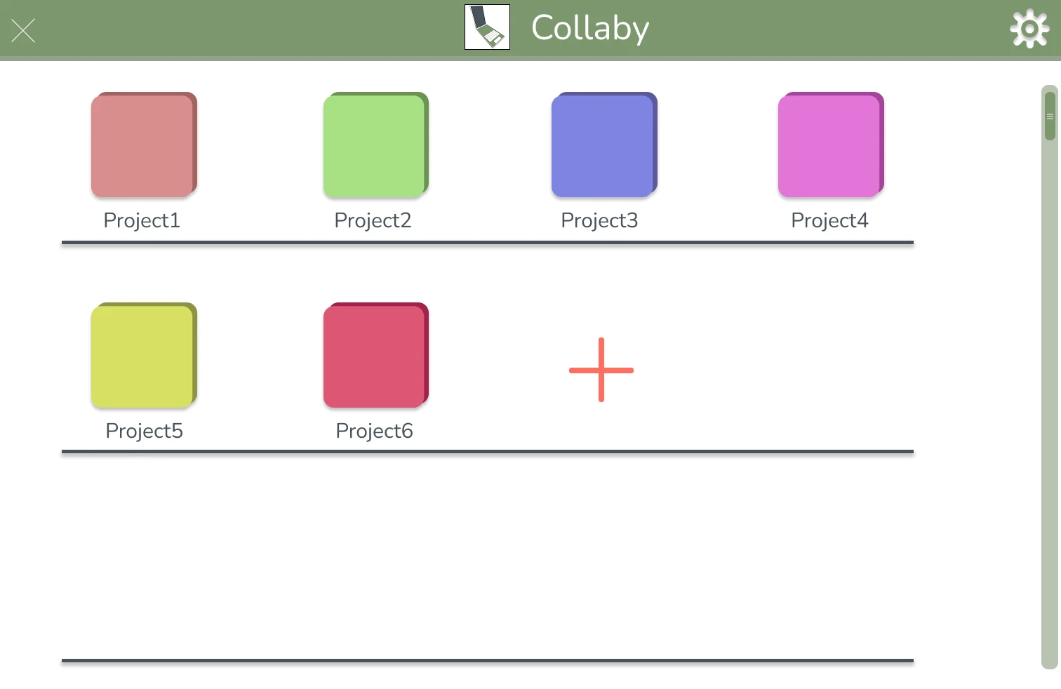
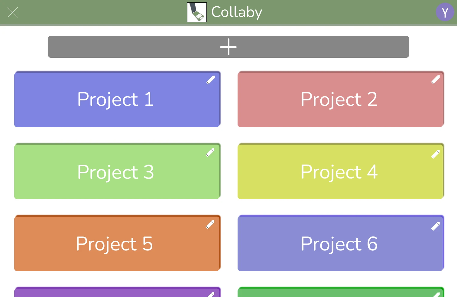
Home Screen:
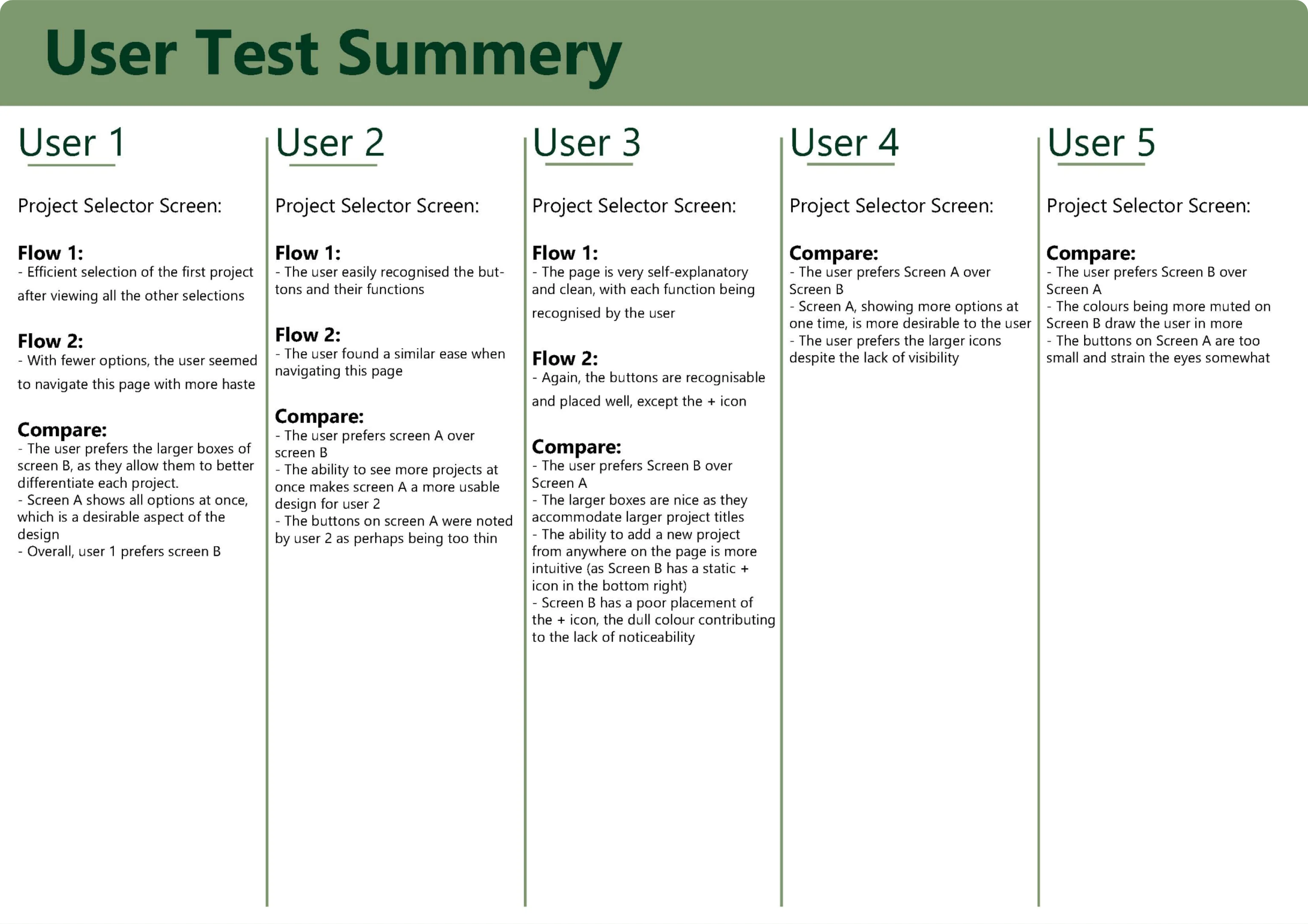
This screen is designed to allow a user to quickly choose a project to work on. This should be the main safe hub for a user.
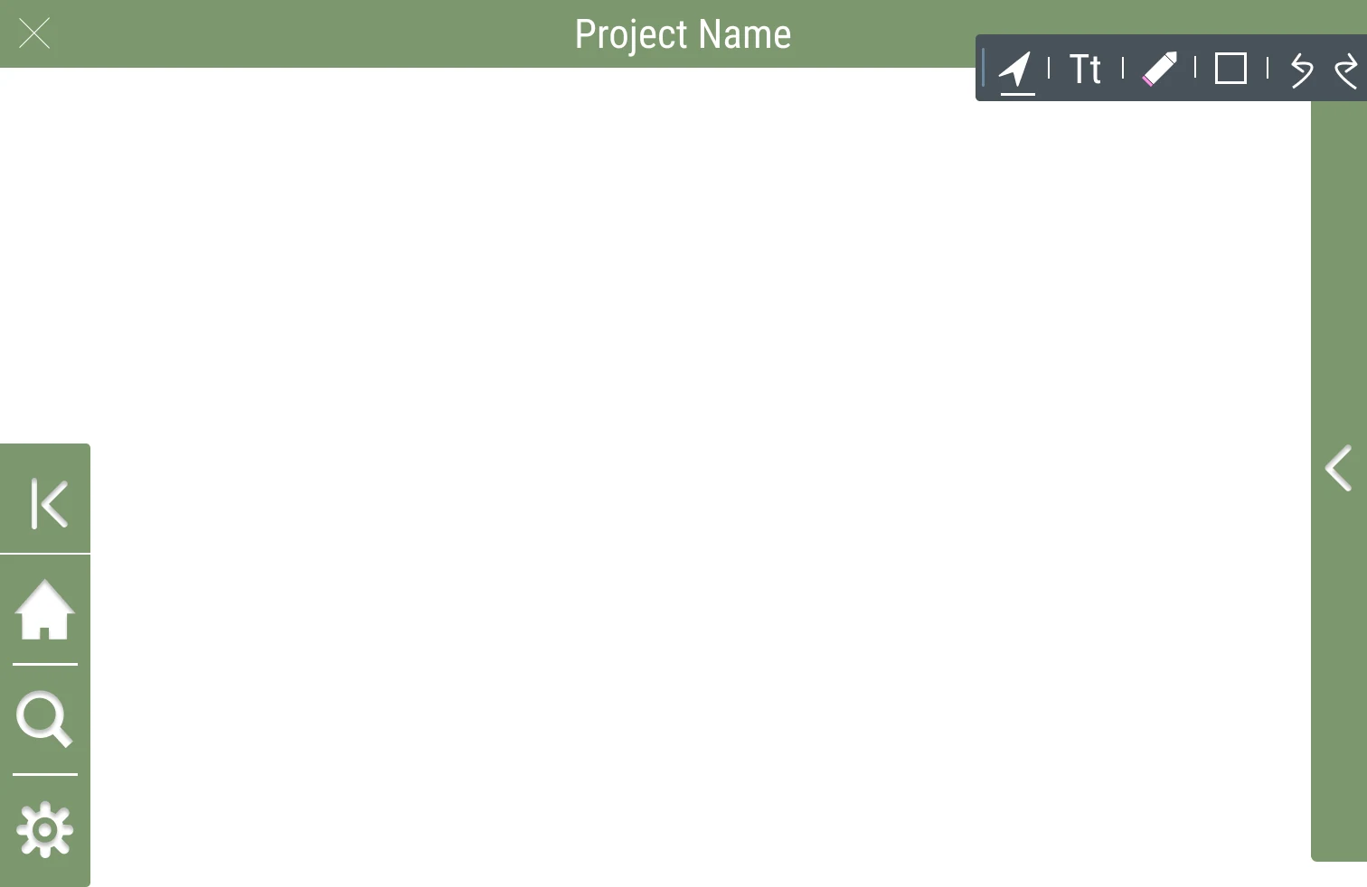
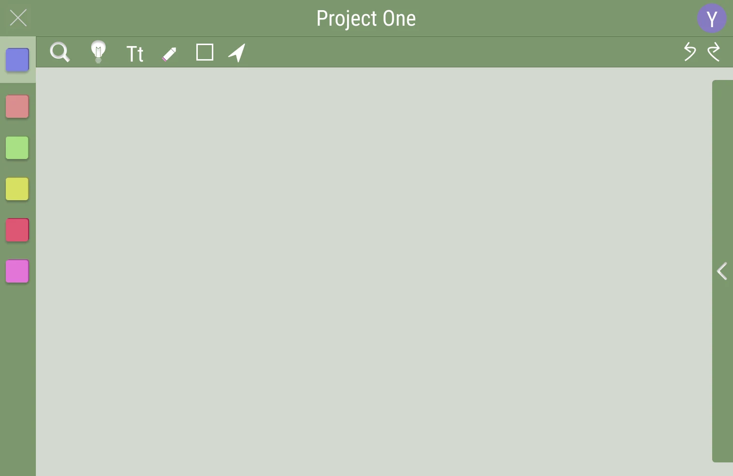
Collaboration Space:
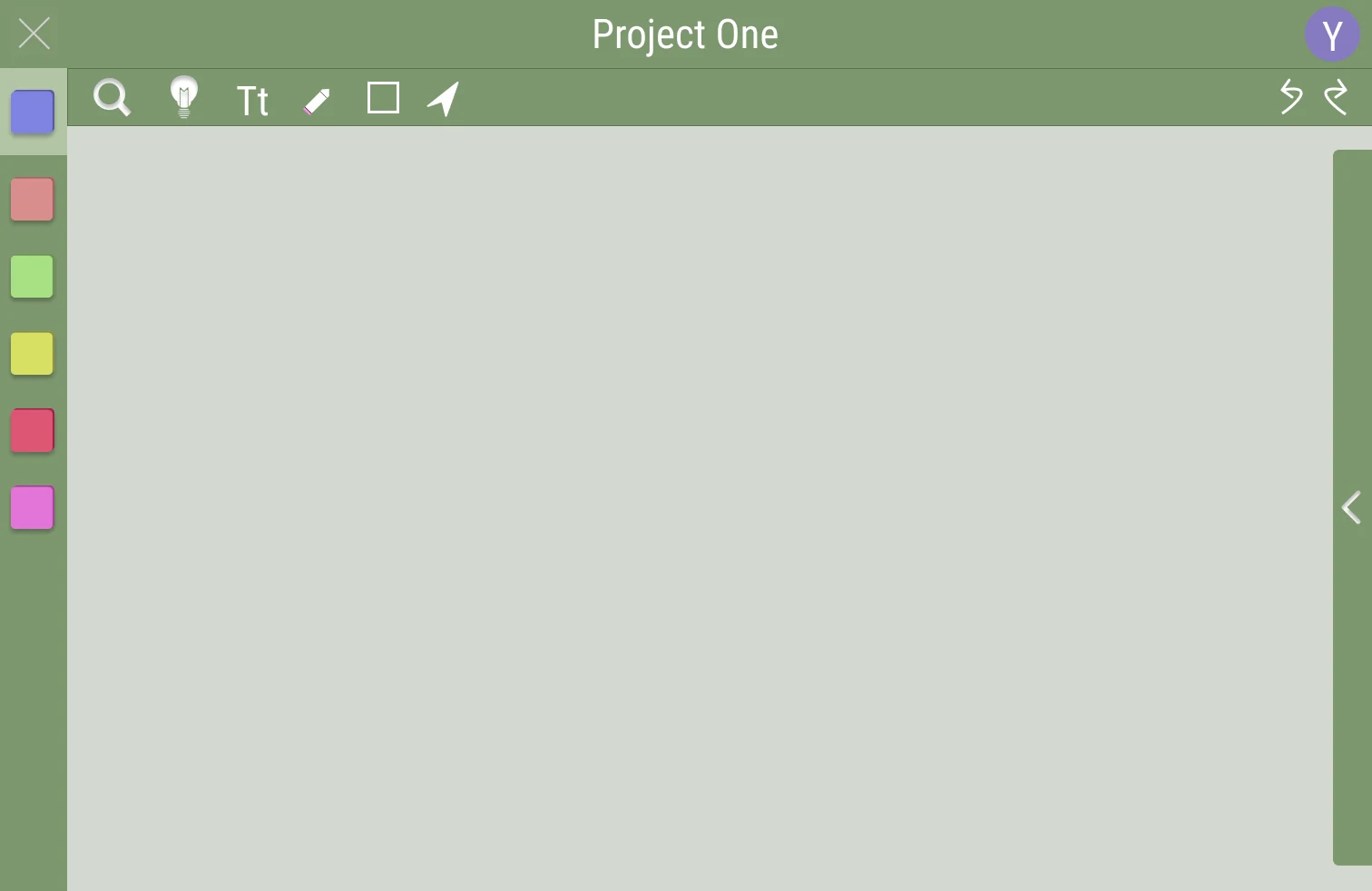
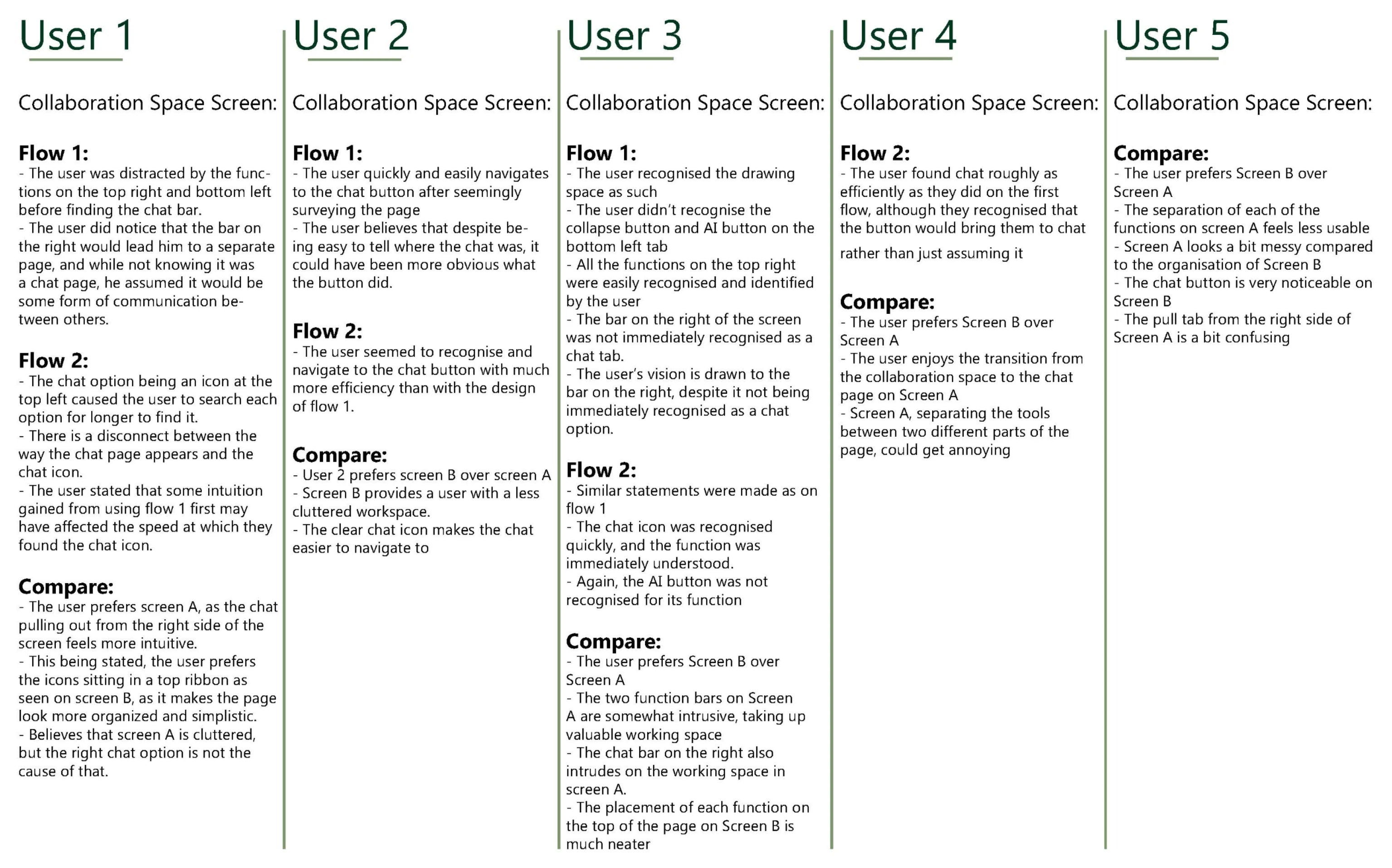
This screen is where any user generated content will be placed. The user could write text, draw, and insert images with their project mates.
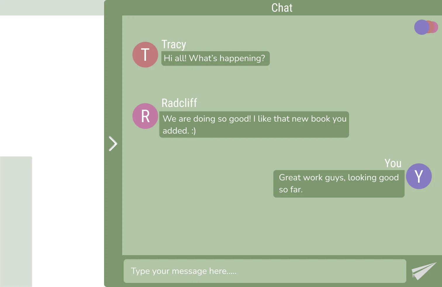
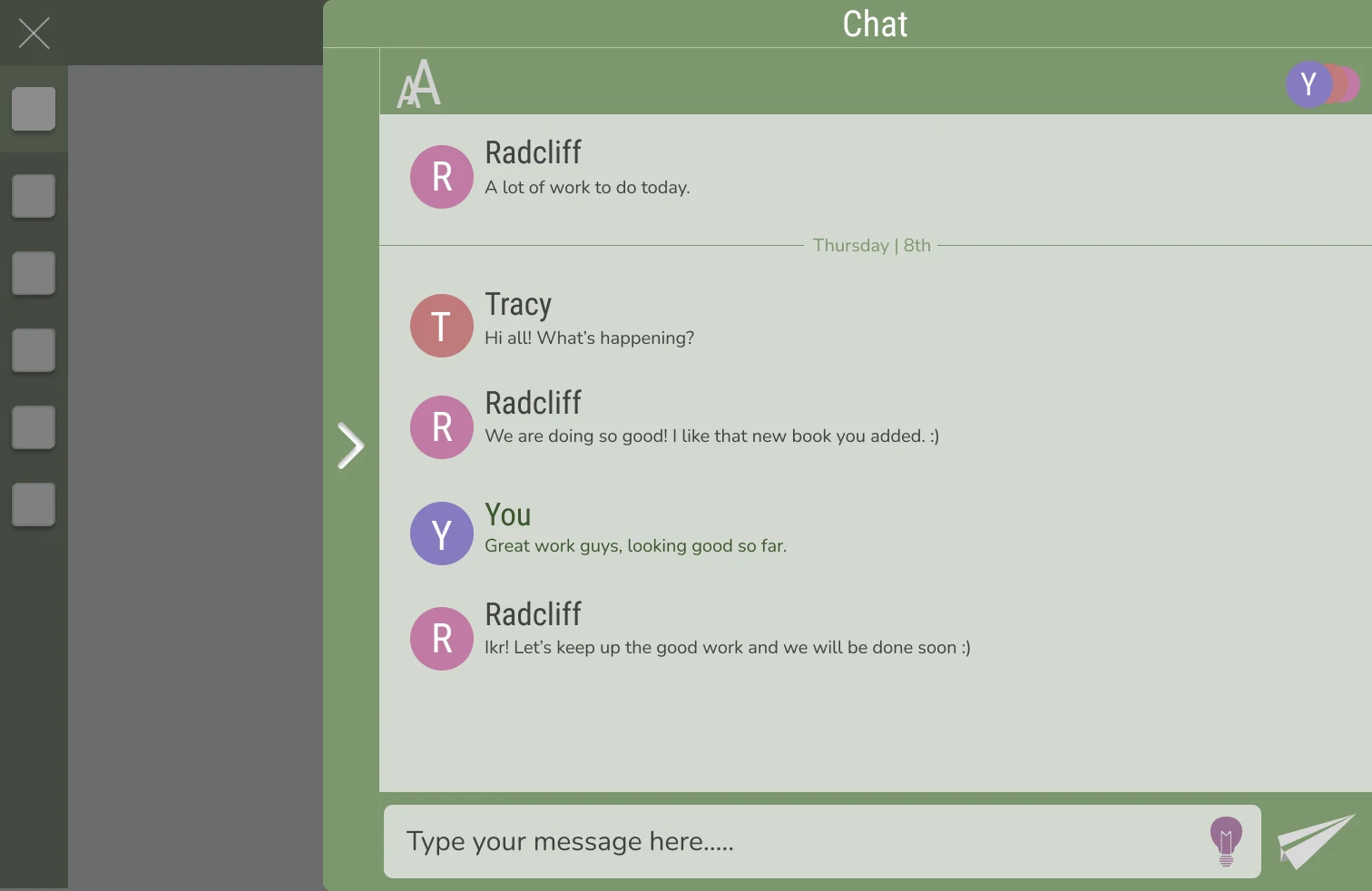
Chat Screen:
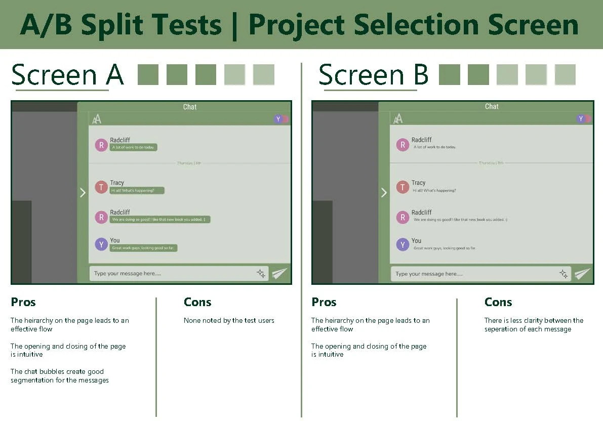
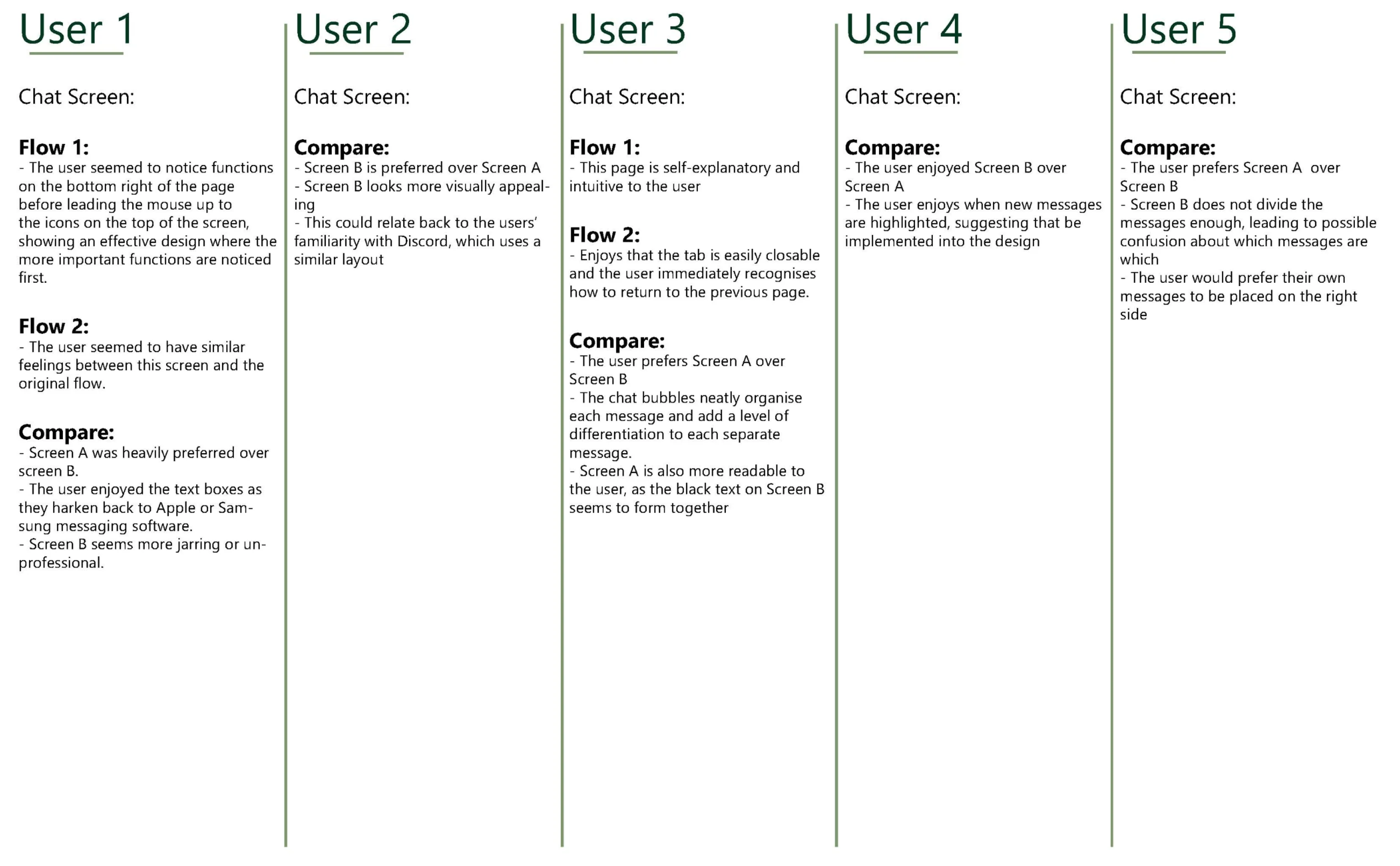
This screen would appear after clicking the pull out bar on the right of the previous screen. This is where a user could interact with any collaborators through text messaging.
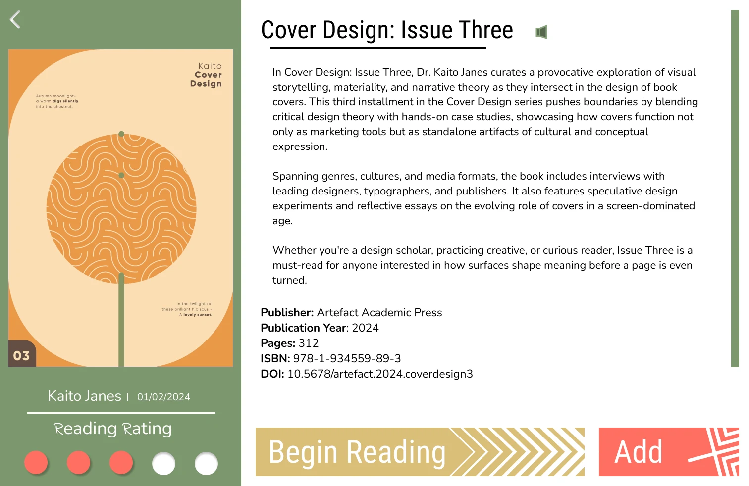
Textbook Screen:
This would be a descriptive page for any textbooks on the application. The add button will allow the user to share the book to the collaboration space. The user would also have the option to share passages or pages to the project and to others.
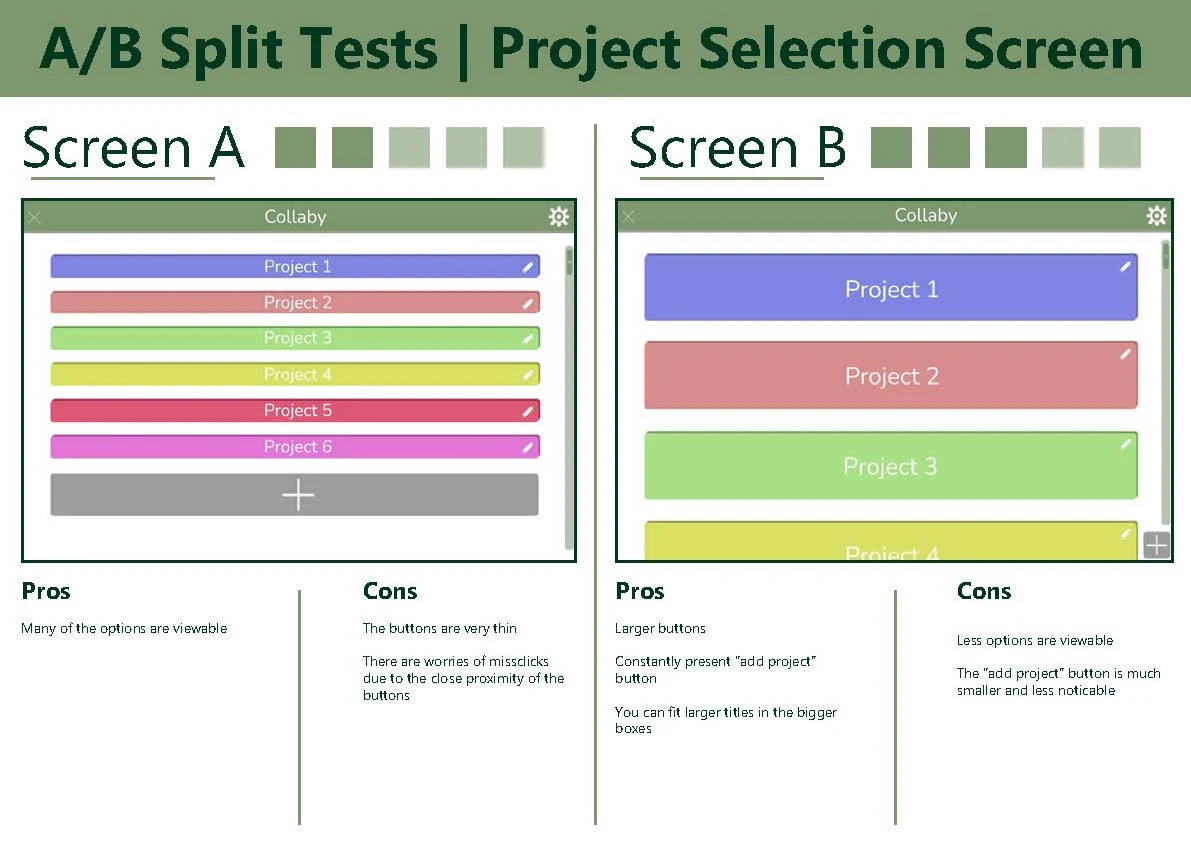
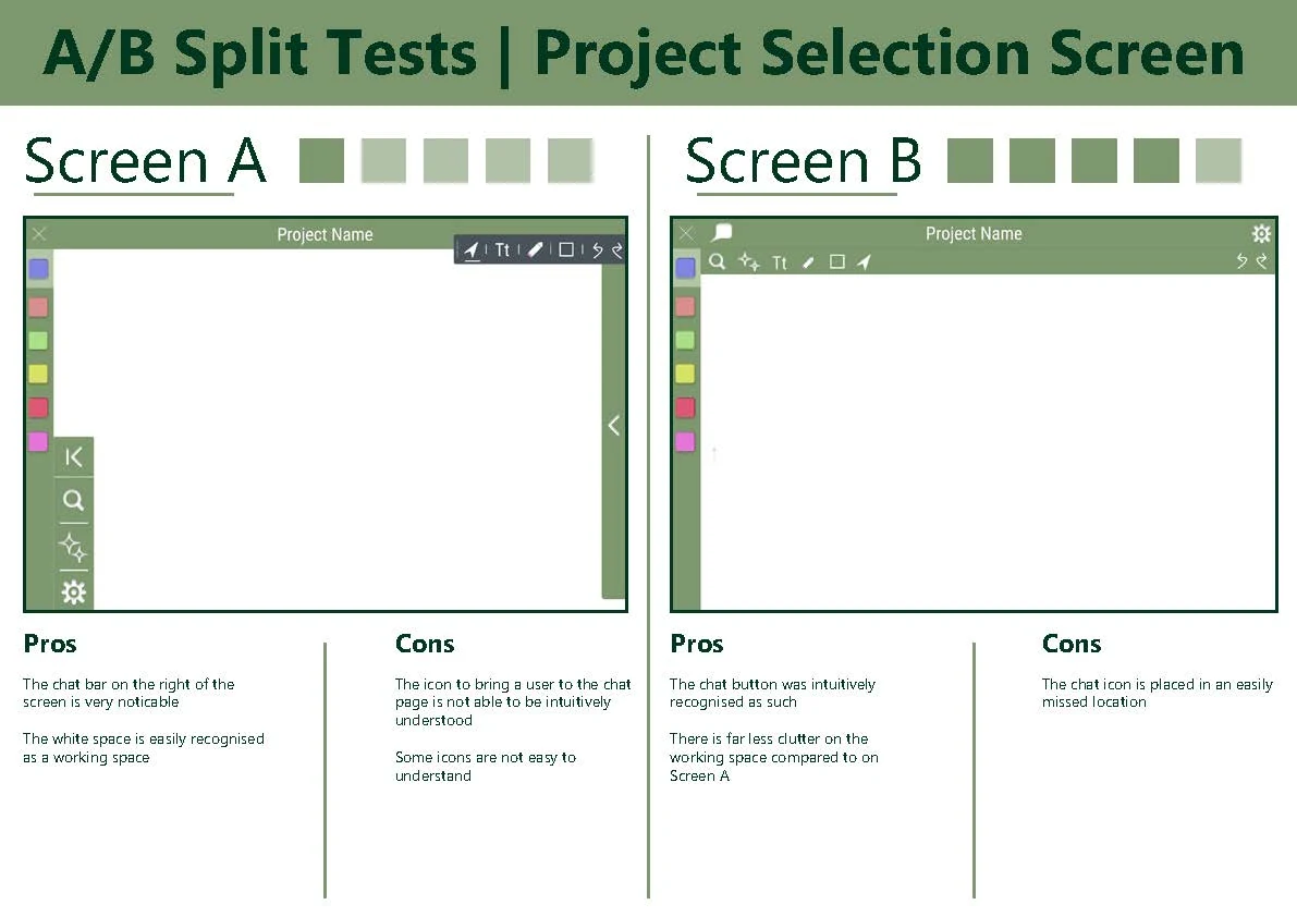
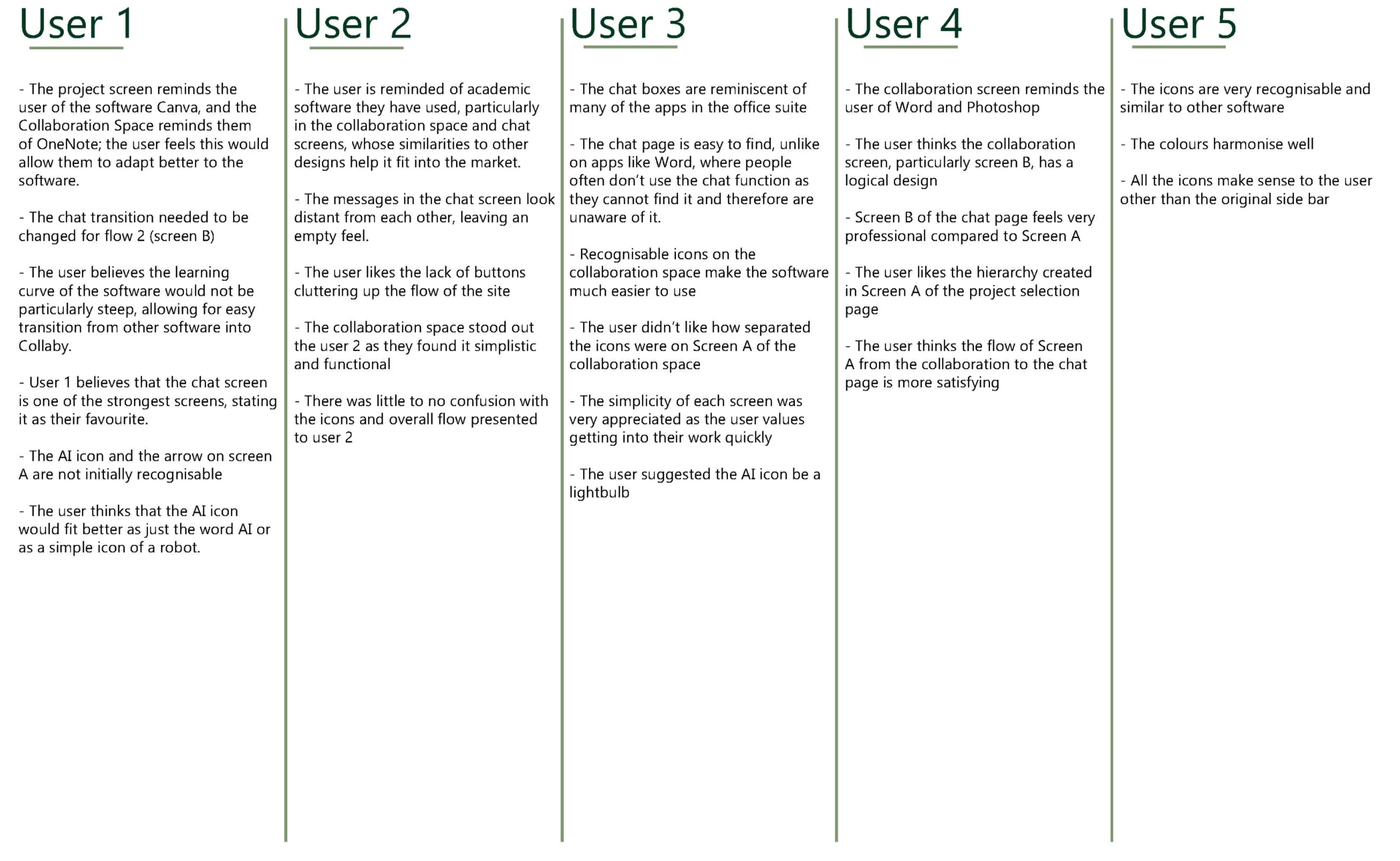
A/B testing
Final screens
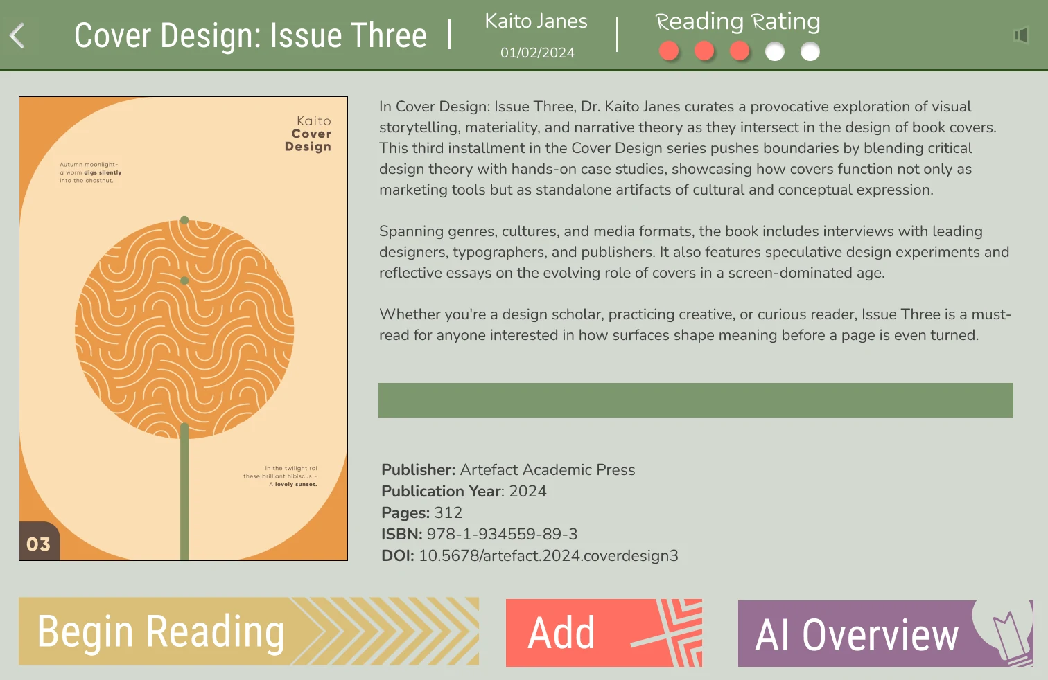
Reflection
This application design turned out very well, with the overall design attractive, usable, and featuring many great and useful features. Along with this, the design and features pushed boundaries within the current market, utilising trends such as collaborative work and AI integration to stand out from competitors.
A problem I feel I encountered during the design process, especially in the final screen design, was the lack of visual direction in the early ideation. With a more in-depth exploration of competitors' visuals and a better-defined direction for the product, I have no doubt the design would have been more consistent and fitting.
As a designer, I have learnt the importance of defining interactions and key features before moving on to more solid visual groundwork. With a more thought-out plan, a design can be completed quickly and therefore iterated on with more depth.