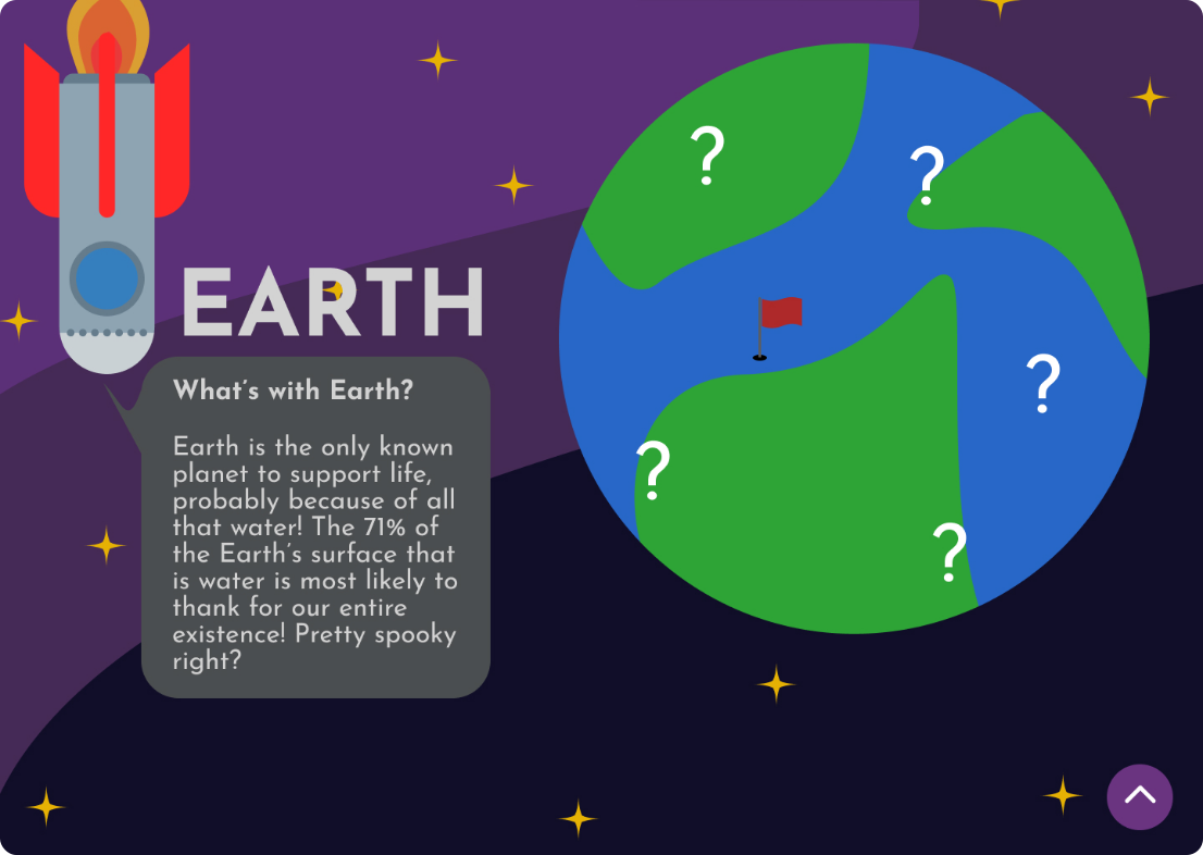
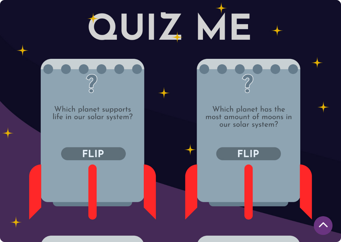
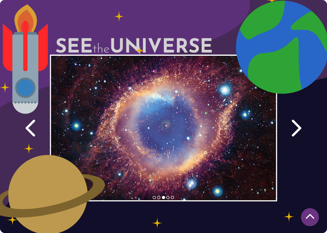
To improve the webpage's flow, the order of each section was rearranged. This was changed to group similar information together. Some changes were also made to the spacing of elements to ensure the page flows better and each element is readable. The most notable of which is removing the planets around the image slider, which blocked the view of the images.
Within project 2, the aesthetics shifted to a more childish tone, which was followed through into project three, with no major aesthetic changes being made. I felt this was the right approach, as the information provided by the webpage would best benefit a younger audience.
While there were some changes to my overall proposal in the final design, it stays true to the ideas presented. Particularly, the goal is to educate the audience in a fun and immersive way. Many of the more specific elements of the solution overview were drastically changed to create a simpler, more satisfying web solution. The same goes for the more complex interaction points, which would have confused a younger audience and diluted the webpage's educational value.