
Client work
Violetta’s
Electrolysis Clinic
Small business: beauty clinic
- Graphic Designer
- UX/UI Designer
- Researcher
Problem analysis
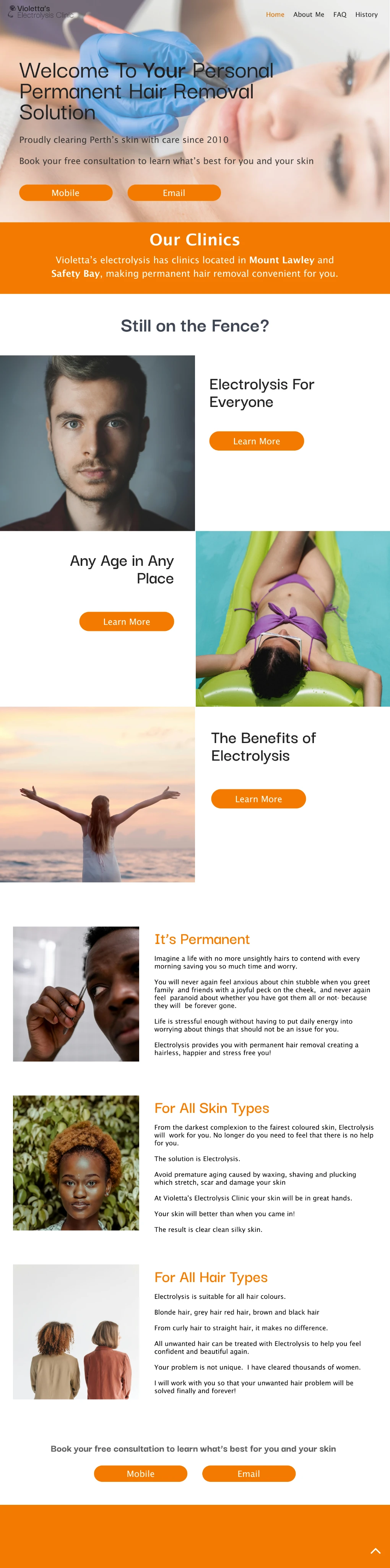
This redesign would address the structural problems in the current website and the amateur look it presents. The current website’s aversion to current web design trends creates a website that is more reminiscent of something users would have expected a decade ago; because of this, I will be researching current trends along with standards set by other beauty company websites.
The project aimed to achieve several key goals that address both user needs and business objectives. Because I am redesigning a website, I look to the current solution and identify the major issues and pain points that I can recognise, along with discussing any current problems the client has noticed.
- Create a professional environment
- Repackage current information
- Capture the brand identity
Current pain points
- Lacklustre font
- Unappealing colour choices
- Poor spacing
- Unengaging writing
- Inconsistent elements
- Flow problems
Reanalysing the problem
After a deeper look at the competition and the problems with the current website, I have set a few key focus points to consider when designing the new website:
-
Professionalism
The key to most beauty-based company websites is maintaining a sterile, professional look. This boosts the brand's confidence, as the company will appear more legitimate and trustworthy.
-
Clear Flows
A common pitfall for these sites has been a confusing or unclear flow. As the customer base ranges from young to old, technological literacy cannot be assumed; any function or flow must be simple and understandable to everyone.
-
Comfortability
Many of these beauty sites aim for a clean, comfortable design that persuades potential customers to trust and feel comfortable with someone working on their body. It’s important to consider that this line is somewhat adjacent to the medical field.
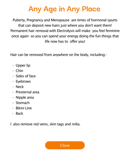
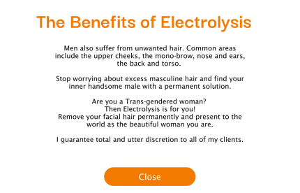
Final designs
Reflection
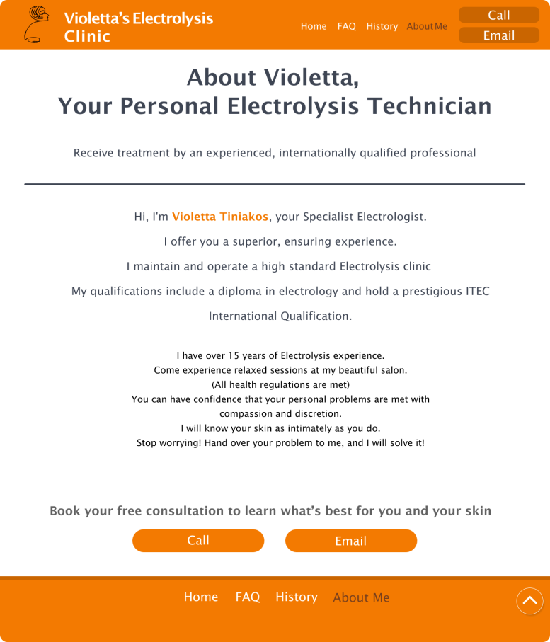
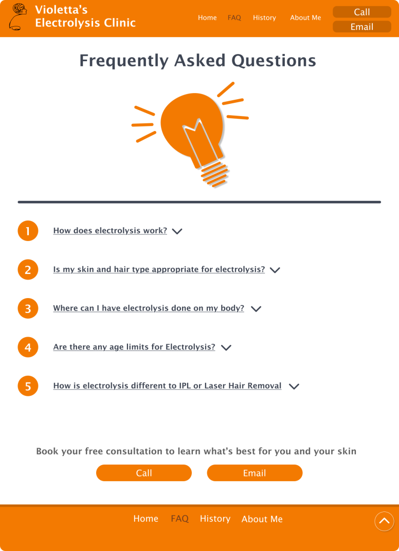
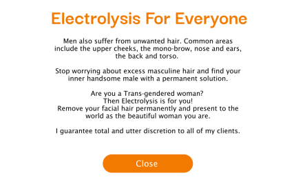
This webpage was somewhat difficult to design, particularly due to the client's demands. The colour scheme and desire for heavy amounts of information heavily restricted my ideas, pulling me towards a generic design. I believe I should have ignored some of these restrictions when iterating and wireframing to create a more unique design, then morphed those designs to fit the client's needs. Despite this, the final design accurately depicts the business while remaining attractive and interesting.